

Countless books have been written about how to boost your work productivity. But all along, you may have just needed a brush and a can of paint.
Your work environment can have an incredible effect on your energy, creativity, and focus, but let’s be real—most of us don’t have time to read a textbook on color psychology. Instead, we asked top interior designers for their advice on the best office paint colors.
See below for their go-to paint shades, which can help promote a productive space.
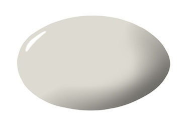
PALE OAK BY BENJAMIN MOORE
“A pale green, like Benjamin Moore’s Pale Oak, is easy on the eyes and helps keep stress levels down. An office can often be a place that is tense, so counteracting that with a restful tone can be just what you need.” —Marika Meyer
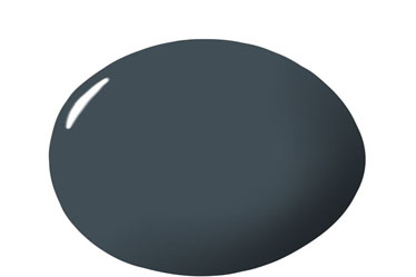
HAGUE BLUE BY FARROW & BALL
“We love a dark, bold color for an office wall, trim, and ceilings. Using a deeper tone helps distinguish the room the minute you step foot inside and close the door behind you. It feels cozy.” —Julie Massucco
LICHEN BY FARROW & BALL
“I once read that olive green is the traditional color of peace. I can’t think of a place more in need of peace than a coworking space designed for a family with teenagers!” —Marika Meyer
DEAD SALMON BY FARROW & BALL
“This is one of my favorite colors of all time, and not just because of its fantastic name. It’s a great choice for an office due to its mellowing effect. It’s not too pink but also not too fleshy and looks great with aged wood and modern materials.” —Bella Zakarian Mancini
HALE NAVY BY BENJAMIN MOORE
“Blue is always a go-to color, but it really sets the tone in the office. On the one hand, blue is thought of as a calming, peaceful color, and darker shades are also associated with intelligence and strength. If you want an office that inspires deep thoughts and concentration, Hale Navy by Benjamin Moore is a great choice.” —Marika Meyer
NICKEL BY BENJAMIN MOORE
“Nickel by Benjamin Moore is a light gray with blue hues that’s perfect for a home-office space. The lightness of the color produces a calming and peaceful aesthetic. The blue hues stimulate the mind, increase productivity, and help you stay focused! Who doesn’t like to be calm and focused when it comes to work?” —Nina Magon
WEST COAST BY BENJAMIN MOORE
“I love this shade—it’s warm and clean at the same time. Blue is the easiest color to live and work with, and along with the reflective quality of a glossy finish, it helps bring the outdoors inside.” —Caroline Rafferty
STUDIO GREEN 93 BY FARROW & BALL
“This deep, dark green, in either a matte or satin finish, will bring a dramatic mood to any home office. It is a true Renaissance color! The rich, saturated pigments respond extremely well to all types of light and remarkably emerge much greener than on the color card. Since green is the color of growth, life, and renewal, an office clad in this hue will promote calmness, harmony, a strong sense of balance, reassurance, safety, and productivity?” —Keita Turner
POINTING BY FARROW & BALL
“We used Pointing by Farrow & Ball in our own office. It is one of my favorite off-whites and acts like a fabulous Instagram filter. It gives your room that perfect warm glow that you only get with natural sunlight.” —Alyssa Kapito
ST. JOHN BLUE BY BENJAMIN MOORE
“The color is deep but not too overwhelming, as we needed a great base to work from in a creative office! One might think that too much color in an office space would be distracting, but it’s actually more inspiring and motivating, while the deep blue of this hue is simultaneously relaxing and tranquil.” —Kati Curtis


Your Message