

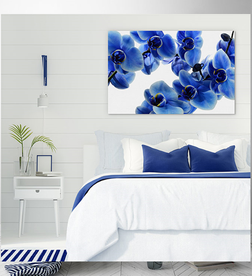
In a surprise revival, the Pantone colour of the year 2020 is Classic Blue. Deviating from recent years where the colours have been more trend focussed and forward-thinking, Pantone has decided that we need a bit more of a conventional palette in our lives.
‘We are living in a time that requires trust and faith. It is this kind of constancy and confidence that is expressed by Pantone 19-405 Classic Blue, a solid and dependable blue hue we can always rely on.’ Leatrice Eiseman Executive Director, Pantone Color Institute.
Classic Blue works on many levels and that’s why it’s pegged to be huge this year. It’s a colour for those who like to look outside the box and those who prefer to stick to time tested decor styles. A truly dependable tone. What better way to kick start a new decade of decor?
Explore four fantastic ways you can make Pantone’s colour of 2020 feel right at home!
Keep coasting
Hamptons style is incredibly popular because it evokes luxury, whilst keeping things crisp and clean. Classic Blue is perfectly paired with white and is a core part of this decor style.
‘Instilling calm, confidence, and connection, this enduring blue hue highlights our desire for a dependable and stable foundation on which to build as we cross the threshold into a new era.’
‘Easily applied across so many different materials, textures, and finishes, PANTONE 19-4052 Classic Blue is a dependable blue that can take you in many different directions, expressing tradition and elegance, as well as unexpected boldness.’
Adding rattan accents that feature this deep and friendly blue will lend a natural feel to any well polished decor. Introduce an earthly element for a modern take on a classic style.
Orange you glad it’s retro?
On the flip side, Classic Blue can breathe new life into a retro look too. It can give your room or home a real sense of character and personality. This style is all about fun and is full of energy!
Classic Blue may sound old and stuffy, but it can pack a punch. It provides an excellent base for a more traditional palette or you can contrast with bolder colours like Glistening, Mango or Lime Punch.
Stitch it all together with a delicious vintage orange tone (think tangerine, persimmon, or ginger – yum!). This will give you a retro feel without seeming dated.
You can ease your way in gently by picking a piece of retro furniture to pair with blue artwork or double down with Classic Blue furniture and retro art.
An art deco touch like ‘Orange Fanfare’ or a pop of burnt orange is a wonderful complement and displays a sense of cheerful nostalgia.
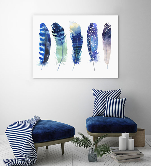
A total bluesfest
For true blue lovers wanting to walk on the wild side, why not try layering hues to create the ultimate in soothing and invigorating decor?
Just think of the exquisite natural splendour of our planet – sea, sky, and sapphires to name just a few! You can be inspired by these worldly beauties every time you walk into a room with a range of blues.
Classic Blue also offers depth and texture without overwhelming the eyes or brain, which is why it works magnificently in abstract art. So make the most of it: paint your walls blue, add blue furniture and furnishings, bedding or artwork and cap it off with a touch of light wood, green plants or brass.
You can choose whether you go softly, softly or super bold with a monochromatic approach— depending on your preferences, personality and existing decor.


Your Message