

If recent trends are any indicator of the power of a perfect pink, we suggest you put your paint plans on pause until you consider using the color in your home. From millennial pink to Pantone’s Living coral pink has remained at the forefront of great design, and—from the looks of it—isn't going away anytime soon. Whether you’re craving a bold refresh with rich berry pinks, or want to try something subtle like a pale pastel, the versatility of the color is undeniably vast, with ideas of every space and style.
Still not convinced? We asked top designers and industry experts to share their favorite pink shades, along with advice on how—and where—to make it work.
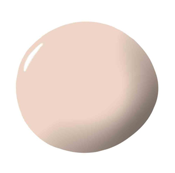
PINK GROUND, FARROW & BALL
“Farrow & Ball's Pink Ground is soft, warm, and tender and it looks great with any color. It can be sophisticated and also very youthful. I love it with a great red and conversely with a deep emerald green. It must be called Pink Ground for a reason…it looks likes its neighbors on the color wheel as well as its opposition. It’s a flattering color on everyone, especially when applied to the ceiling.”
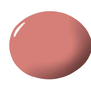
PINK SKY, CLARE
“Pink Sky by Clare evokes an earthy and enveloping feeling. This more saturated pink is the perfect answer to almost any room needing personality and added warmth. It transcends styles and easily pairs with a variety of color palettes. Placed in a design with a lighter color scheme, the walls read bold, highlighting architectural features. Paired with a more saturated palette, the color adds richness.”
PEONY, BENJAMIN MOORE
“Benjamin Moore's Peony is one of my favorite hot pinks. As the name suggests, the color is derived from the peony, the most maximalist of flowers. With its lush blooms and endless petals, the peony is over the top in the best possible way. We love this color because it's bright, but with black undertones, so it has coolness to it. We painted it on the ceiling of this bedroom for maximum impact!”
BRIDAL PINK, BENJAMIN MOORE
“I love using Benjamin Moore's Bridal Pink. It has just the right amount of peach in it and it's feminine but not too sweet, and plays well in any light.”
PINK STARBURST, BENJAMIN MOORE
“If you love pink as much as I do, you run to it—not away from it—and embrace the sweet nursery pinks as much as more saturated colors like Pink Starburst by Benjamin Moore. To stand up to something so bold, I pair Pink Starburst with strong abstract art, crisp black and white fabrics, and a funky 1970’s Moroccan rug.”
POP, CLARE
“For a dash of optimistic and unique color, Pop by Clare is a versatile option. The yellow undertone immediately warms up a space. It’s perfect for an updated rustic kitchen, bringing freshness to matte honed tiles and rustic wood finishes. Think English countryside meets modern bohemian.”
PARIS PINK, PORTOLA PAINTS
“Paris Pink by Portola Paints is a favorite of mine. Subtle, delicate and gender neutral–it works beautifully on a ceiling to add a little color.”
ROSÉ SEASON, CLARE
"Rosé Season is a sophisticated shade of pink that’s fresh, warm, and bright. Like the name implies, it conjures up warm memories of good times with full glasses of rosé!”
HAPPENSTANCE, PORTOLA PAINTS
"Pink is one of my favorite colors! But, it can be tricky to pull off. Happenstance has a dynamic and earthy quality to it that is very versatile. It can just as easily be used in your dining room or your daughter's room."
OPAL, BENJAMIN MOORE
“Benjamin Moore's Opal is a perfectly subtle shade of pink that lights up every room with a pearly glow. It’s especially great on ceilings to get an extra luminescence when light from a chandelier reflects on it.”
PINK CORSAGE, BENJAMIN MOORE
“The great thing about the 'Millennial Pink' trend is that it universalized pink and made it more accessible to those who may have shied away in the past. From a designer's perspective, pink is a fantastic paint color for walls because the warmth makes people's skin look bright and healthy. Pink Corsage by Benjamin Moore turns up the volume with raspberry pink tones for a robust, vibrant take on the hue.”


Your Message