

Icy blues, snowy whites, cozy creams, iron reds—the colors and palettes inspired by winter are seasonally charming yet perennially fresh. Go full-on arctic tundra with an assortment of frosty hues, or create a cozy winter respite with shades to envelop your home in warmth. But no matter the path you choose, we guarantee you won’t be wishing for Spring.
To help us nail down the formula for a perfect winter palette, we asked our favorite interior designers to share their top shades of the season. Read on for 20 winter color scheme ideas to invite into your home this year.
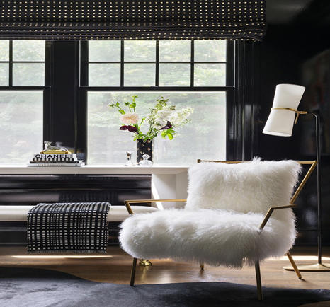
BLACK WITH WARM FABRICS
“Black is a bold but classic choice for winter decorating. Paired with warm fabrics like furs and velvets, a black room can create a luxurious retreat where you won’t feel bad hibernating (and binge-watching Netflix) until spring.”
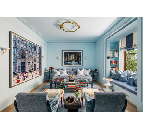
ICY BLUE MIX
“We wrapped this library in plaster and used Benjamin Moore’s Harbor Fog on the walls and ceiling for an icy blue effect. Then we layered in snowy white accents and varying shades of blue in the upholstery, draperies, and rug. The mix makes for a crisp, cool wintry palette, while the gold light fixture and banquette pulls add touches of warmth to the room.”
SMOKY PURPLE AND NEUTRALS
“Winter is a fitting time to embrace cooler hues, and this one is a beauty. But when it comes to purple, there’s a fine line between opulent and garish. Opt for a shade with the right amount of gray, like this one, that reads smoky and beautiful; it’s the color you experience just as the sky goes black. Layering in neutrals helps keep the space feeling fresh, warm, and welcoming.”
EARTHY TEXTURE AND WARM METAL TONES
“Nothing builds warmth on a cold winter day than cozying up to a space like this with a piping hot bowl of ramen. Inspired by my time spent living and working in Japan, this sumptuous bedroom retreat embraces a tonal palette of earthy textures and warm metal tones powerful enough to stave off any chill.”
CHOCOLATE BROWN, CINNAMON, AND TAN
"The start of the colder season reminds me of warm colors, chocolate browns, cinnamon, and tan-like tones. These colors have a sense of richness as well as homeyness and coziness, which happen to also be important aspects of We Work's interior design ethos. In Dutch we have a special word for this: 'Gezellig', similar to the Danish word 'Hygge.'”
DARK BLUE-GREENS
“If you’re a color-lover, dark blue green is a great hue that can bring some life to your space without feeling too spring-like. Blues and greens are colors that are known to have a relaxing, calming effect, so this dark blend is suited to provide comfort and coziness in even the coldest months.”
CREAMY TONES AND METALLIC ACCENTS
“I don’t subscribe to 'no white after Labor Day'—when it comes to jeans or decor. Winter white is the height of cozy. White with rich creamy tones, grays, and metallic accents is irresistible. Layering texture in a monochromatic scheme is a key element to creating warmth and interest.”
TOASTED WALNUT, SILVER, AND CREAM
“This is an elegant yet calm aesthetic that is perfect for vacation homes and smaller powder rooms or personal studies. I prefer implementing this glamorous palette in more intimate spaces—a treat to be appreciated in small portions. Given the neutral color scheme, feel free to adorn with as much crystal, glass, and detailed pattern as desired to complete your private winter wonderland.”
COOL NEUTRALS AND IRON REDS
“Cool neutral textures with pops of 'rouge de fer' (aka iron red) bring layers of warmth to this New York City living room. A custom decorative paint glaze brings dimension and life to this chaste color scheme. Although the room is neutral in tone, it is layered with subtle patterns and lavish textures: damasks, velvets, and animal prints. French antiques lend warm mahogany grace notes and antique red Chinoiserie screens bring pigment and verticality to dark corners. Ambient light from table lamps, sconces, and picture lights create an inviting glow. Cashmere throw blankets in burnt umber are the room’s practical winter accessory and Ficus trees are a reminder of the spring to come.”
BRIGHT WHITES AND SATURATED POPS
“Capturing the essence of winter is all about creating contrast. A tree in snow looks like a black slice within the white landscape, whereas the same tree in spring is nestled within a sea of green land, blue sky, and pops of floral color. Capturing the winter spirit through contrast can be done in many ways: Dark walls with jewel toned or bright white furnishings, or bright white walls with white furnishings that are accented with a few saturated colors or materials. There is an option for any aesthetic.”


Your Message