

Choosing the right shade of paint for your home isn't an easy task, but it's worth the effort since a simple color change can transform a room. A gorgeous gray, for instance, can turn an interior from dreary to sophisticate. The perfect red hue, meanwhile, can take it from lackluster to dramatic in an instant.
But before you start shopping, keep in mind that there are a slew of factors to consider when searching for the best paint color for a project. Beyond finding a hue that works in harmony with the rest of your home, you need to consider lighting—both natural and artificial—and how it can alter the appearance of a shade. And don't forget the impact different finishes, like semi-gloss or eggshell, can have on the overall look of a paint color.
If you’re in need of inspiration to revamp your kitchen with a stunning paint color, consider this list of go-to shades from some of our favorite interior designers.
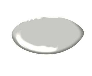
BENJAMIN MOORE HARBOR GRAY AC-25
"Harbor Gray by Benjamin Moore gives the kitchen just enough color so it's not stark white. It's the perfect neutral that works with brass, lots of marbles, and other colors. There's so much going on in the kitchen and it can take it all." — Suzanne Ascher
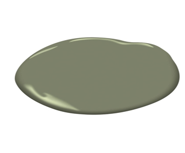
BENJAMIN MOORE GALÁPAGOS GREEN 475
"Galápagos Green is a decadently rich deep green. It is elevated and perfect for added drama to butlers pantry’s or powder rooms." — Alison Pickart
BENJAMIN MOORE ICE BLUE 2052-70
"I love Benjamin Moore Ice Blue, a wonderful, icy, crisp celadon-toned pale blue, and the exact color of a daiquiri. I particularly like using it for warmer climates because it always feels fresh, soothing, and cool. I love it for cabinetry in a luscious high-gloss, and it’s a great accent color on a ceiling or floor in a kitchen, too. With white, it’s preppy fabulous and it’s instant glamour when paired with black. And old-timers in the South say that it wards off flies, but I haven’t ever tested that!" — Danielle Rollins
FARROW & BALL PEGNOIR NO. 286
"Pegnoir is beautiful soft lavender with a base of gray. It is a fun unexpected color for the kitchen, and a modern twist to basic gray." — Alison Pickart
BENJAMIN MOORE RACCOON FUR 2126-20
"For kitchens with lots of natural light and elevated ceilings, I like to use Raccoon Fur from Benjamin Moore (2126-20). After applying a few hand-brushed coats, I have it sanded and waxed so that the finished texture is beautifully chalky and uneven." — Dan Scotti
FARROW & BALL MIZZLE NO. 266
"For color, I love Farrow & Ball's 'Mizzle;' it is a dusty, grey green, again, a very versatile color. It's soft, yet fresh at the same time, and feels super earthy. Mizzle is also a super flexible color, that plays well with so many different finishes. There is also a timelessness to this color, I could see it as being original to a turn-of-the-century butler's pantry." — Amy Sklar
BENJAMIN MOORE REVERE PEWTER HC-172
"Revere Pewter is the perfect grey-beige color for cabinets that looks beautiful with brass hardware and Calcutta marble countertops. It is still fresh and bright, but a nice alternative to white." — Shelley Johnstone


Your Message