

Bored of playing it safe when it comes to color palettes?
Color is all around us yet when it comes to bringing it into our homes, many homemakers tend to play it safe by opting for a predominantly neutral scheme.
For a long time interiors have embraced the paler palette; with hues typically ranging from the various shades of white, all the way up to the taupe’s or pastel colored tones, however, when it came to walls, that's where color kind of stopped.
While this has been the go-to solution for many, more and more homemakers (not just Interior Designers) have been becoming braver with their choice of paint colors and the results have been nothing short of stunning.
EXPERIMENTING WITH COLOR
Sometimes we just need a little extra encouragement in order to feel comfortable with using color, or to see examples of successful outcomes. If you desire something a little more daring when it comes to color schemes, you've come to the right place!
We have come up with two inspiring color scheme ideas to show you how the use of bolder tones can be successfully applied to an interior.
The following color schemes will create a beautiful mood and bring life your living room.
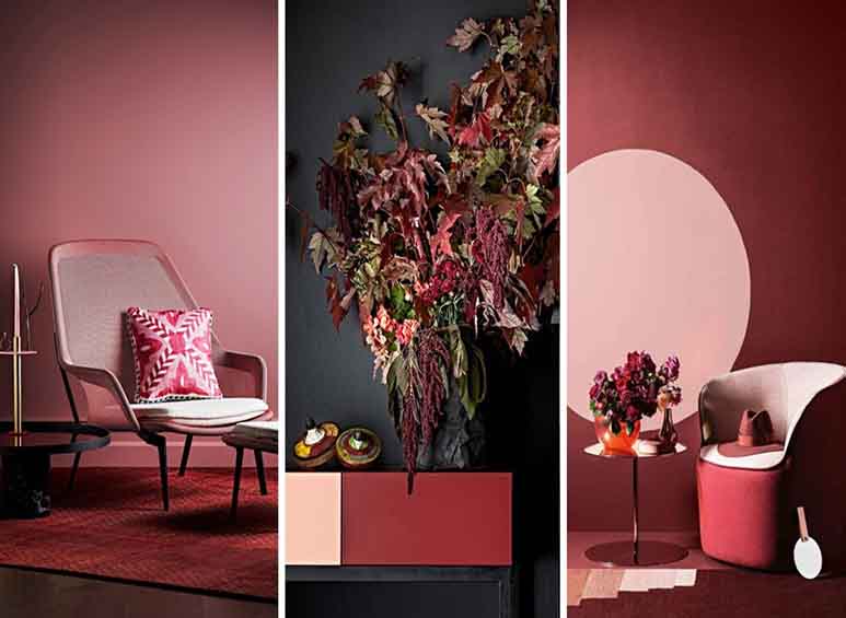
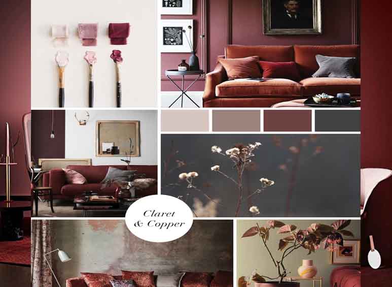
CLARET & COPPER COLOR SCHEME
Darker shades evoke a sense of intimacy and elegance, and invite cosiness and warmth into the home. Teaming darker colors such as charcoals and rich burgundy’s with copper, terracotta or blush accents will create depth, contrast and balance, while shifting the ambience of a room to one of peace and calm.
Although this color palette is both liberating and empowering, it instils an innate sense of quiet (an almost meditative quality) that will a help a living space become a place to retreat and find some solace from the business of life’s daily routines.
OLIVE & IVY COLOR SCHEME
The colors in this palette are clean, crisp, and simple. The natural tones of olive and ivy offer a leafy look and feel. While the off-whites with their subtle differences, have a minimal undertone that sit beautifully alongside the greens.
Punctuated by warm ochre tones that provide energy, these colors are incredibly easy to inject into a space as they are harmonious, balanced and fresh. When applied to a living room setting these combined hues will create a restful, relaxed and positive atmosphere that bring the colors of the natural world to life.
CHOOSING A COLOUR SCHEME
You can now see how color can really set the tone for a space and how it can have a strong and powerful effect on mood and emotions. When choosing a color palette, find one speaks to you. It should evoke feelings of well-being and transport you to a place of joy and comfort.
Remember, painting is the easiest and most cost effective way to change the entire look and feel of a room. You can experiment freely with peace of mind knowing that should you change your mind, it’s nothing a new lick of paint can’t fix!


Your Message