

The shape of the floor was irregular and the available space was tight, as compared to the headcount requirement. A linear, planning concept allowed room for an open design with optimum utilisation of available space.
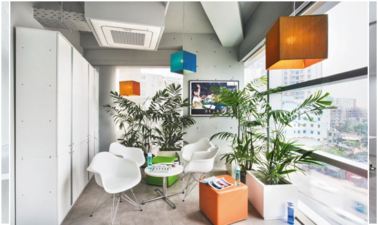
A few cozy corners were carved out from the residual spaces. Since, it was not easy to experiment too much because of huge budget constraints, Majumder and his team’s approach was simplistic and minimalistic.
“We developed a few photo realistic 3D views for client approval. We kept refining these as time progressed and finally implemented them in the project. Our idea to use colours from Asian Paint’ own colour shade book was a game changer and helped us win the heart of the client,” Majumder says.
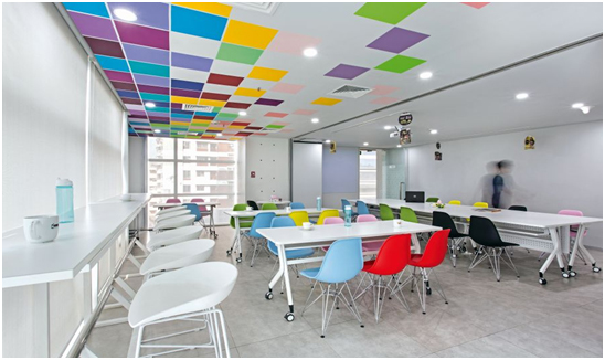
The main concept was based on ‘Pixels’ and the team tried to translate the same in their designs. For a contrasting look, the colour scheme for the floors and ceilings was kept as a sober monochrome. Different yet complementing colours from Asian Paints’ shade cards were selected for the pixels and the end result was a vibrant story.
“We were briefed by the client to segregate the office space into two distinct areas, which we did by introducing a coloured screen between the two, functional spaces. The brief also guided us to place the cabins, meeting rooms and the prayer room in the right locations to adhere to better functionality and usability,” Majumder says.
For the furniture, flooring and ceiling, Majumder and his team, comprising Architect and Partner Sukanta Basu and Architect Dibya Sen, used subdued, natural colours to balance the array of colours on the wall surfaces. The use of glass in partitions enabled them to create a visual impact of expanse of the space and also to bring in transparency so as to complement the colored pixels.
From day one, the team wanted to design a canvas as the background, with colourful elements in the foreground. This was achieved by creating a colour-neutral space with glass, grey and white composition over which the coloured pixels became the focal point of interest.
The right blending of branding and art played the pivotal role for the success of the project. Apart from the coloured wall pixels, a few areas were identified to put up the company branding in frames.
This added to the warm look and feel of the office space. The introduction of huddles in the corners surrounded with such photo frames, lounge furniture and plants brought about a homely ambience to the interior.
The main design material, which was the turning point of the entire story, was acrylic emulsion paint, a product by Asian Paints. Most of the other building materials were locally procured, while the furniture pieces and chairs were imported from China. “Our plan and execution worked exactly how we wanted them to, and we received an overwhelming response from the client. They were delighted with the new office space,” Majumder says. True to their name, his team created a utopian space for Asian Paints and its employees.


Your Message