

1.70s SCANDI
This is a quite a pared-back look with simple lines and a cheery colour palette. Debbie Drake, Head of Design at Dunelm, explains: 'Straight from the 1970s, Elements has taken a graphic turn with an earthy colour palette, geometric prints and natural materials. Macrame planters are seen throughout and are complemented by rich accent colours and statement lighting.' Follow the 'less is more' philosophy and don’t over clutter, pick out an accent colour like tangerine shown here.
Shop the look: Fulton small sideboard, £179, mirror, £20, Mala dome 1 light fitting, £42, Doria twisted string table lamp, £32, 3-seater Prague sofa, £349, Breckon stripe throw, £30, roots stripe cushion, £16, textured cushion, £20, Fulton coffee tables, set of 2, £119, Dunelm.
1.RECYCLED KITCHEN
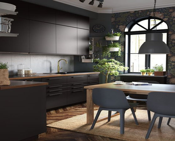
Sustainability is key this year and you’ll start to see more awareness from some of your favourite homeware stores as Anna Granath, Product Developer at Ikea, explains. 'What we do at Ikea has a big impact on the environment due to the large quantities we produce so by using recycled materials we can create products which are more environmentally-friendly and sustainable,' she says. 'Our ambition at Ikea is to increase the share of recycled materials in our products so we are looking into new ways to re-use materials, such as paper, fibre, foam and plastic, so that we can give them a new life.'
This kitchen is made from recycled wood and covered with a plastic foil made from recycled PET bottles and the end result is a great looking kitchen that also ticks another trend – darker kitchens. Team with wooden worktops, brass taps and lots of plants to create warmth.
3. BEAUTIFUL TEXTURES
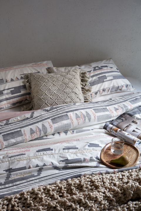
For the first time this year, French Connection have launched a bedding range and it perfectly fits into this lovely tactile trend, based around slow living with the emphasis on natural materials. This look is all about creating a cosy feel, mix your textures and team with tactile throws and cushions.
Catharine Denham, Head of Homeware, explains: 'Our Spring 19 collection is a celebration of artisan craft, inspired by the slow living trend – considered designs curated in natural substrates, one of a kind pieces using raw materials and hand-finished techniques. The weave is key for Spring 19, across furniture, decorative items and textiles including the new woven cotton bedding collection. Produced using ethical cottons that have been enzyme washed, a natural process over chemicals that creates an all over softness and relaxed aesthetic to the bed linen.'
4. MIX & MATCH PATTERN
To counteract the minimalist look, pattern is really key this season – and not just one pattern but a combination of styles used together. The key is to keep the colour palette the same tonally, for example, here you can see that everything has the same level of softness and nothing stands out, so it’s all balanced visually. The plain furniture acts as a blank canvas for the patterned cushions and the white floorboards and coffee table works the same way for the terrazzo rug. The copper wallpaper pulls the whole look together.
Paul Tattersall, Head of Buying for Homeware at JD Williams, says: 'Including pattern can be a daunting task, so try introducing a patterned wallpaper or rug in a spectrum of subtle tones such as pink, ochre and ecru. A statement print really adds colour and character to an airy room and light-coloured furniture whilst still encapsulating a calming environment.'
5. MUSTARD
'Mustard hues have been the go-to shade over the warmer months in our homes. No longer content with smaller pops of mustard, we are seeing a move towards larger investment pieces of furniture which add a bold, refreshing burst of colour to our living spaces,' explains Melanie Archer, Colour, Material and Finish designer at John Lewis & Partners. It’s a versatile shade that works brilliantly with millennial pink, teal and indigo blue, and of course, crisp white if you want to create more of a fresh look.
6. MID-CENTURY
7. HOMESPUN STYLE CERAMICS
Organic style ceramics with subtle patterns and an artisanal element will be popular this summer. Look out for embossed jugs and vases and fill them full of pretty blooms and foraged stems. Colours to look out for are all the naturals plus blush pink and jet black.
8. OPEN SHELVING
Instead of hiding everything away, it’s now a trend to have your items on show. For example, in the kitchen, invest in some Kilner jars of varying heights for pasta, oats, dried fruit etc. Melissa Kirk, Head of Design at Harvey Jones explains: 'Clear wall space is becoming a popular choice. Even in smaller spaces, homeowners are opting to put all the cabinetry in the base units so the walls remain open and bright. Clients are choosing to add shelving in metals and other styles to act as a design accent to the main scheme.'
9. RAW AND UNFINISHED
Opting for classic designs be it shutters, tables, chairs or any other type of furniture will long term be more environmental than opting for styles that are more 'disposable'. Look out for well made pieces with an unfinished look that will stand the test of time. For example, shutters are a great option as they keep your home warm in winter and cool in the summer.
10. SCALLOPED SHAPES
Who doesn’t love a shapely chair? This gentle curving scalloped edge chair is easy on the eye and super comfy to boot. You’ll also find this scalloped shape in other pieces – like bedheads, basins and tiles. It harks back to the art deco era where it was seen on flapper dresses, mirrors and decorative accessories. The colours are bold so team with prints and patterns for a decorative look.
11. LIVING CORAL
Pantone's colour of 2019 is Living Coral, a warming nurturing shade that’s set to energise and enliven our homes. And now, Crown have brought out their own version called Powdered Clay. Judy Smith, Crown’s Colour Consultant, explains: 'Taking inspiration from earth minerals and shell clay, this is a colour that evokes warmth and reassurance, creating a calming environment. The soft pastel palette works well with other chalky hues, or for a pop of colour bright oranges and reds will add drama. For earthiness and keeping a muted colour scheme, add raw organic textures in soft furnishings and lighting.'


Your Message