

When designers describe themselves as “color experts,” we often think they’re referring to bright, bold hues—magentas, emeralds, cyans, and other trending, electric colors that together craft a decadent, maximalist space. However, color experts also know how to evaluate minuscule differences in shade and tone easily missed by an untrained eye, and they bring this color finesse to neutral-hued spaces as often as those that are brilliantly colored. Here, top Dering Hall designers skilled in subtlety reveal how to achieve an elegant neutral space rich in multi-dimensional color.
MATERIAL MATTERS
Favorite Neutral Shade: Taupes and grays with pink undertones
"A kitchen in a neutral palette is a soothing environment to spend time in, and neutrals make the food and people in the space look gorgeous.
"Warm wood tones, rich metal finishes, and surface materials with depth are inherently welcoming—ideal for the heart of the home. I often use resilient quartzite slabs for countertops and backsplashes, many having crystalline waves of beige, taupe, gray, and green hues swirling through them. Bleached walnut and cerused oak are two of my go-to cabinetry finishes, paired with off-white walls and earthy stone floors.
"For warmth and interest on the walls, I like to use troweled plaster finishes in varying degrees of sheen and texture depending on the style. I have no fear of mixing metals, and use combinations of stainless steel with bronze or brass tones to provide contrast and pops in a neutral palette. I introduce luxurious natural materials to make the palette more dynamic—for example, I'll use accents in shagreen, parchment, or straw marquetry, or larger pieces like distressed leather banquettes or a smoky bronze mirror."
A RAINBOW OF NEUTRALS
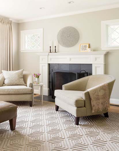
"I add strong patterns and contrast tones and textures, which makes all the difference–and creates a beautiful and sophisticated space.
"My go-to neutrals are a rainbow assortment of off-whites. Some of my favorites include Mountain Peak White, from Benjamin Moore’s OC Collection. It has just a whisper of green. I also love Glacier White, which has a hint of gray, and Mayonnaise is a beautiful color for a delicious white kitchen. I also really love the tonal quality of taupe–it is so warm and earthy, and it can also be modern and sophisticated or dark and moody. As an example, Benjamin Moore River Reflections is a very versatile color, timeless and classic, and practical, too. It mixes well in many color palettes."
CREATIVE CONTRASTS
"A neutral color scheme usually relies on a layered composition of subtle and muted color tones. It is helpful to keep an eye on the individual color tones to ensure that there is enough contrast for the eye to distinguish the various layers. I often add structure with select darker elements as well as highlights with the occasional metal accent. Plants or a single splash of color are another way to create bright focal points.
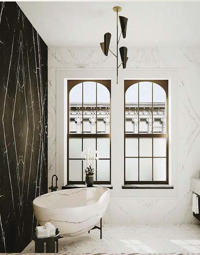
"When it comes to the design for a bathroom, I like to think that less is definitely more. I prefer a neutral color palette, as it helps to create a calming environment, a place where one gathers one's focus while getting ready in the morning or unwinds in a soothing bath at the end of the day."
MIXED FINISHES
"I often like to treat colors as neutrals by selecting a color that has a complexity to it or a rich pigmentation/saturation. In this case [pictured above], a custom olive green in high gloss is very striking, yet timeless and sophisticated. That said, White Dove and Vanilla Milkshake by Benjamin Moore are my go-to neutral neutrals–not too gray, not too cream, not too stark, just right.
"It is crucial to observe the light at multiple times throughout the day. All colors, and neutrals in particular, can look completely different in different areas of the room at different times of the day. Additionally, consider furniture and materials that will be in the room, as metals can bounce light, furniture can create shadows on the walls, and fabrics can absorb light.
"One of the most successful ways to pair neutrals is to use several shades within the same hue and then mix the paint finishes creating visual interest. High-gloss walls or a high-gloss ceiling will create depth and a dynamic reflectiveness, allowing light to bounce around. If you're not looking to make as much of a statement, an eggshell or flat finish looks clean on walls with satin or gloss finish on trim, window casings, and door surrounds to give a sophisticated highlight to architectural details."
TONE-ON-TONE LAYERING
"When it comes my designs, the fabrics and textures are just as important as the color palette. Because I like to keep the color palette soft in neutral spaces, I love adding plenty of texture by including a variety of fabrics that add depth to the overall design. Boucle, wool, sheepskin, linen–you name it, I love it! For neutral bedrooms, I like to keep the color palette soft, even with accent colors.
"I am also a tone-on-tone person. I love layering creams and whites on top of one another with different textures and materials. This adds so much depth and interest to a design."
REJUVENATION, RESTORATION & RELAXATION
"Neutral palettes are perfect when we are going for rejuvenation, restoration, and relaxation. They act as a wonderful backdrop for beautiful furnishings, art, and accessories, allowing statement pieces to shine. Neutral palettes are all we need when we have truly stunning architecture, as that requires very little extra help.
"I love a creamy, light, warm gray or cool beige as a neutral. You say potato, I say potato, right? The room's exposure–the direction and amount of windows/light–and how you intend to use the space, as well as how you want to feel in the space, play a huge role in the color that will be right for a specific space. Benjamin Moore's China White is one of our go-to neutrals for its subtle, sophisticated tone and warmth. Farrow & Ball's School House White is always stunning too."
TEXTURE & MORE TEXTURE
"To keep a design interesting, I use texture, contrast... and more texture! I prefer to create depth through layers of rich textures and contrasting finishes. While I could never pick just one favorite neutral, Benjamin Moore has done an excellent job curating an off-white fan deck. For a cool neutral, I like Gray Owl. For a warm neutral, I would opt for Edgecomb Gray."


Your Message