

Gray might not be at the top of your list of go-to paint colors, but it's one that leading interior designers rely on time and time again for its versatility. The timeless hue works for a slew of spaces, whether it's a dining area or a bedroom design scheme.
Curious about the best gray paints to consider for your home? Read on for a roundup of designers' top gray paint colors, from deep hues to classic pale shades. These hues don't disappoint.
WARM GRAYS
REVERE PEWTER, BENJAMIN MOORE
"For those on the fence about gray, I sometimes introduce Benjamin Moore's Revere Pewter. It threads the line with greige and has warmer brown undertones. When a darker gray shade is going to feel too dark or somber, I find a gray like this one integrates well with warmer wood furnishings while keeping the room light."
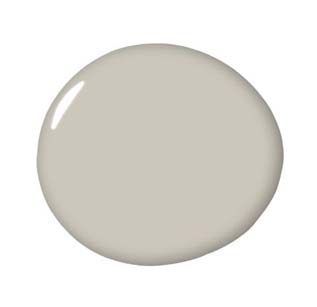
CONFORTH WHITE, FARROW & BALL
"This pale gray paint has a touch of taupe/lavender that provides a wonderful neutral backdrop to both traditional and modern interiors. I love how the color evolves over the day: cooler earlier in the day and a bit more moody at night."
CORNFORTH WHITE, FARROW & BALL
"This is a perfect tone of gray. It catches light beautifully. It's subtle and very chic. It is the perfect complement to any other neutral."
AMMONITE, FARROW & BALL
"It's the perfect neutral and a great alternative to off-white. I recently painted a wood paneled room this color, and the overall effect was warm and inviting."
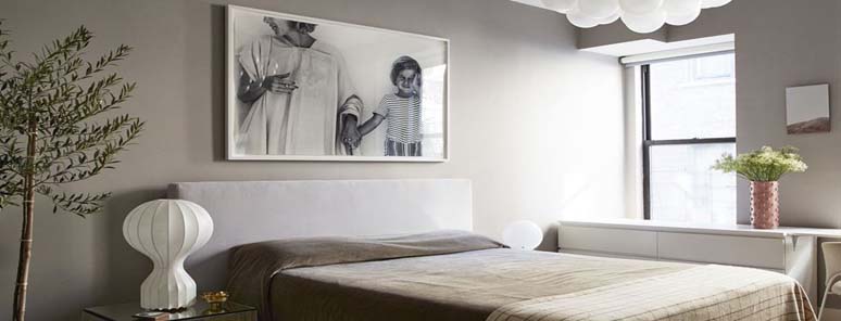
MODERN GRAY, SHERWIN WILLIAMS
"This is the ideal background color: warm, soft, and plays well with everyone. It's like the consummate party hostess who brings out the best in every guest. It's the perfect backdrop for blues (denim, chambray, navy) in a living room, and makes olive green look fantastic. It can handle fuchsia and orange in a bunk room, but also goes beautifully soft with creams and grays when used in a master bedroom or kitchen."
ELEPHANT'S BREATH, FARROW & BALL
"This warm and luxuriant shade is stunning in a room with white woodwork and crystal chandeliers. Pop it with coral or hot pink."


Your Message