

Like a classic red lipstick, the color red in an interior design scheme is timeless, bold, and undeniably sexy. Whether you dress it up—or pare it down—the versatility of the shade makes it workable in all spaces. From cherry red lacquer to muted brick red, there are endless color pairings to bring the shade into the mix.
We talked to some top designers about their all-time favorite red color schemes, along with a list of supporting shades that help bring the look to life. Read on for perfect red color combinations you're sure to fall in love with.
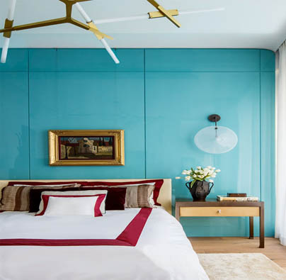
OXBLOOD, GOLD, AND ROBIN'S EGG BLUE
“I have always loved robin's egg blue and oxblood as a color combination, whether in design, fashion, or jewelry. It is an unexpected composition; the richness of the oxblood balances the brightness of the robin's egg blue and creates a sensational symphony. The crème and bronze are calming, yet a dynamic background to such rich colors. Perfect for a bedroom or entryway, as it’s exciting yet serene and welcoming.”
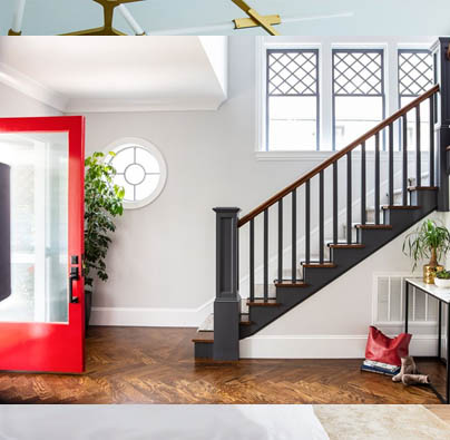
GLOSSY RED WITH WHITE AND GREY
“Red is so vibrant and bold, we recommend incorporating it into homes the same way you would incorporate it into an outfit: Tried is true combos like a red high heel paired with jeans and a tee shirt. This can be seen in interior design when you pair a white or grey house with a glossy red front door. The understated overall paint color lets the delicious red shine without becoming overbearing.”
TOMATO RED, LEOPARD, AND HUNTER GREEN
“You can pair red and green without making it look like Christmas! By working with a red that leans a little orange and lush velvet in hunter green on the sofa, we successfully use a color pairing that is typically reserved for the holidays. The leopard acts like a neutral that ties the two together.”
BERRY RED, PALE PINK, AND CAMEL
“I am definitely a red girl and think it goes with just about everything. My favorite combo, however, is berry red, pale pink, and camel. So classic. So beautiful. I think what I love about this combo is how unexpected it is. Camel is always totally chic and works nearly anywhere. The deep red is classic and adds a depth that makes it moody. Adding in the pale pink turns the combination on its side, which is something I try to do in all my projects. (Mansur Gavriel gets these combos perfectly!)”
CHERRY RED, PALE PINK, WALNUT, AND GOLD
“My grandmother Dearie’s favorite color was red, so when I designed her bedroom, I injected bold cherry accents in the rug, pillows, and plush side chair. But we kept the entire space soft and romantic by wrapping the room in pale pink. Walnut wood and ebonized trim ground the space and gold metallic embellishments further the glam effect.”
BERRY RED, INDIGO, AND AQUA
“Red and blue are complementary colors on the color wheel, so they are sure to be beautiful together no matter what, but stick to these more interesting shades of blue to avoid the Americana or nautical vibe.”
HIGH-GLOSS RED, ROYAL BLUE, GOLD, AND TAUPE
“The deep red pairs perfectly with different shades of taupe, and is very chic and sophisticated. Layering in other jewel tones like royal blue and gold adds another level of richness, while grounding the deep red high-gloss lacquer. I love using this color combination, especially in a library, media, or dining room as these palettes truly elevate any space to another level.”
RED, DEEP BLUE, AND OCHRE
“Red is such a rich and sultry color; it’s a great match for other opulent shades such as deep blues and ambient ochres.”
BRICK RED, OCHRE, AND CHOCOLATE
“In this space, we paired yellow ochre with chocolate and brick red. This shade of ochre is muted so it plays like a neutral, but is more interesting than your standard beige. It also creates a bridge between the chocolate and the accents of brick red.”
DEEP RED, TEAK, BRONZE, AND CREAM
“Red is a challenging color, given how strong it is. Working on the Olfelt Residence—designed by Frank Lloyd Wright—has taught us to embrace this color, in its richness and depth. Colors that go well with this deep red are a rich brown tone of wood, like teak, along with brass color, dark bronze, and warm cream colors.”


Your Message